When it comes to imagery, be it photography or CGI, it is always helpful when our clients understand the basics of colors. With this knowledge, we can better communicate with each other regarding the processes and final product. Having a grasp on the fundamentals of color will help empower clients and provide them with the tools they need to better communicate their ideas and suggestions. Below are 10 basic color facts to keep in mind when planning your next project. There will be a quiz after you’re done reading this, so take notes.
We’re just kidding…maybe.
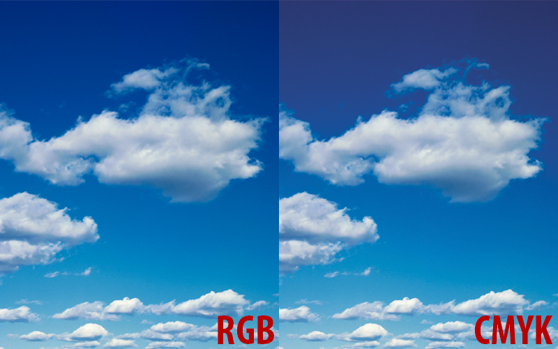
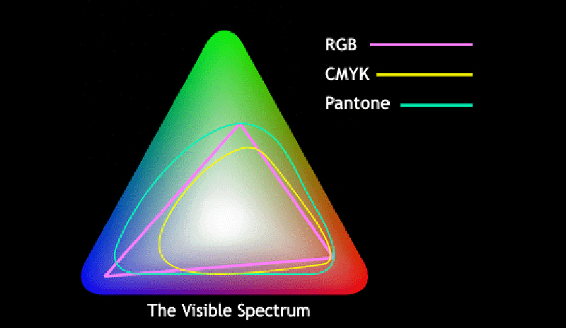
1. CMYK can be very different than RGB
RGB is the color you see on your televisions, computer monitors, phones, and tablets while CMYK colors are specifically used for printing. When you see an image on your computer screen, the colors will most likely be quite different when they are printed. The problem is CMYK doesn’t allow for the very saturated colors that we can see on a screen, which is more noticeable with intense graphics or subject matter like flowers or lorikeets. Of course, we will always work to make your RGB and CMYK colors identical; however, sometimes it’s simply not possible.
Microsoft.CSharp.RuntimeBinder.RuntimeBinderException: 'Newtonsoft.Json.Linq.JValue' does not contain a definition for 'image'
   at CallSite.Target(Closure , CallSite , Object )
   at System.Dynamic.UpdateDelegates.UpdateAndExecute1[T0,TRet](CallSite site, T0 arg0)
   at CallSite.Target(Closure , CallSite , Object )
   at AspNetCore.Views_Partials_grid_editors_media.ExecuteAsync() in E:\www\TRGMultiMedia-trgmultimedia.com\www\Views\Partials\grid\editors\media.cshtml:line 62
   at Microsoft.AspNetCore.Mvc.Razor.RazorView.RenderPageCoreAsync(IRazorPage page, ViewContext context)
   at Microsoft.AspNetCore.Mvc.Razor.RazorView.RenderPageAsync(IRazorPage page, ViewContext context, Boolean invokeViewStarts)
   at Microsoft.AspNetCore.Mvc.Razor.RazorView.RenderAsync(ViewContext context)
   at Microsoft.AspNetCore.Mvc.ViewFeatures.HtmlHelper.RenderPartialCoreAsync(String partialViewName, Object model, ViewDataDictionary viewData, TextWriter writer)
   at Microsoft.AspNetCore.Mvc.ViewFeatures.HtmlHelper.PartialAsync(String partialViewName, Object model, ViewDataDictionary viewData)
   at AspNetCore.Views_Partials_grid_editors_base.ExecuteAsync() in E:\www\TRGMultiMedia-trgmultimedia.com\www\Views\Partials\grid\editors\base.cshtml:line 11
2. CMYK uses vs. RGB uses
As mentioned above, RGB colors are for digital/electronic and CMYK colors are for print. It’s helpful to figure out ahead of time what you will be using your images for so you know which one to ask for. Should you decide later that you want to use your print images for your website, converting CMYK back to RGB is doable, but the colors just won’t pop as much. If you are unsure of your usage or want to play it safe, request both RGB and CMYK and use them accordingly.
3. Until ink hits paper, color is simulated.
Everything up until you have your final printed product – your proofs, what you see on screen, everything – is simulated as to what it should look like post-production. Even our proofer is set up to simulate GRACoL, and though we’re not a GRACoL press, we do what we can to get as close to that in simulation. We are able to simulate other print processes as well, so just let us know if there is one you prefer.
4. Every monitor shows color differently.
Color on all monitors is different, especially when shown on a monitor that hasn’t been calibrated. This is important to keep in mind when you subjectively say it’s better on one monitor vs. another, or if you think the image is too magenta or too "light" on your monitor. It may look that way to you; however, what you are seeing on your monitor may not be accurate, especially if your monitor is not calibrated properly. In cases where your monitor may not be accurate and color is important, we would strongly urge you to request hard proofs (physical printed proofs). Nevertheless, you should take into account your viewing conditions for the proofs, which takes us to our next point.
5. Color looks different under different types of lights.
When you have that hard proof, and you are viewing it under your light source, keep in mind there is a possibility that we viewed it under a different light set up. We generally view proofs at D50 unless otherwise requested, but if you are viewing at a different illuminant, like D65 for example, this means the proof could appear very differently to you than how it appeared to us. A perfect example of this would be when we tried to match a color for MasterBrand cabinets. We had an actual door and worked to get the proof to be exact. We tweaked the color by tiny bits at a time until it was perfect, but when we sent the proof to the client, they were shocked that the color was so different. Likewise, we were stunned that they thought it wasn’t an exact match, and that’s when we discovered they were using a different illuminant than us to view the proof. In short, the image must exist in the right light set up. It’s all an illusion!
6. Effect of lightness on color
Sometimes we’ll be asked to match a color. We do it, but then sometimes afterwards we may be asked to lighten the overall image. The problem is that when we lighten a color (or an entire image overall), we’re actually changing it to a different color. Sometimes we are able to change the contrast of the image or lighten up the image without affecting the product or specific color, but it’s definitely in your best interest to tell us that. The more specific your edits are, the more we are able to make sure we are doing exactly what you are looking for. For more on this, reference point #10.
7. Pantone colors
Pantone makes color swatch books, and each color has a number assigned to it. Clients can flip through the book and find exactly what color they want. They give us the number, and tell us to match the background to that color. The benefit of this is that it allows for easy communication of color between the client, the photographers, and anyone else involved. Make sure to convey this information to your printer as well. We can absolutely match your product to a specific Pantone color, but depending on the printing process, colorspace, as well as the possible need to use a solid ink, you still may not get the printed result you were expecting.
8. Color moods
Let us know what mood you are trying to convey in your shoot and we can play with the colors to help achieve that. If the yellow looks a little dirty in print, we can kick up the magenta. Cooler colors tend to be more stoic and sterile; greenish colors are great for outdoor/fresh looking shots, and so on. Color shifts can also change the perception of time in a scene as well as the mood. For example, in a morning shot, we will use more blue, but in a dusk shot, we will use more orange to accurately portray that time of day. Use color to your advantage!
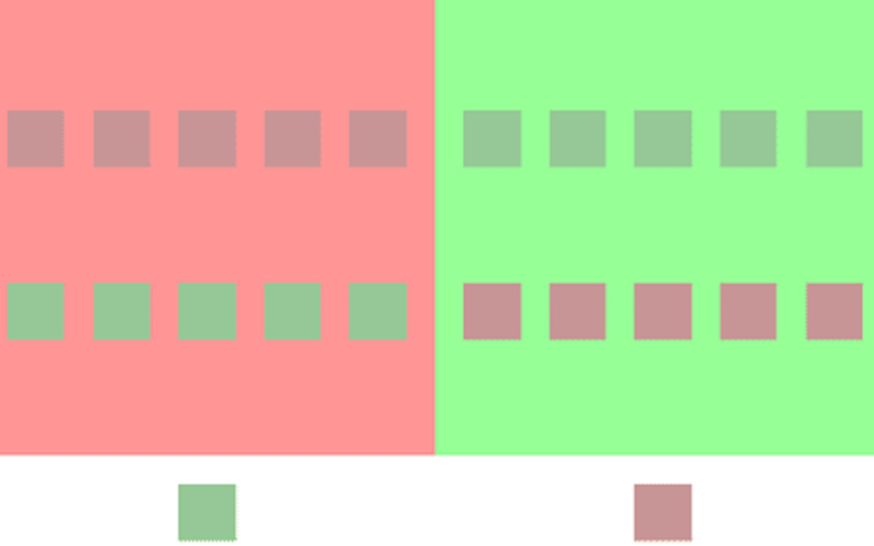
9. Color perceptions
If your image has an overall strength in one particular color, that will affect how the other colors in the image are perceived. It’s important to consider all of the colors that will be surrounding each other since that will affect the final appearance on screen or in print. Using a stylist can be very helpful in this situation. A great example of this is when we photographed a product with a warmer-than-gray finish in a very saturated blue environment. Before the client even saw it, we matched the finish color to their standards, yet the markups they kept sending back commented that the finish color was not correct. We soon realized that the saturated blue environment was tricking the viewer’s eye into thinking it was a different color. To remedy this issue, we made a separate version of the image on a de-saturated background, making the product easily recognizable without the original distracting background. Our eyes can definitely play tricks on us when it comes to color, sometimes making images appear as if they are “wrong” when really it’s just an optical illusion.
10. Know how to talk about color.
There are three key terms everyone should know when it comes to color: hue, saturation, and lightness. Hue is what we think of in terms of identifying colors as red, blue, green, etc. Saturation refers to the intensity of the color. Lastly, lightness is the actual brightness (or darkness) of the color. These three terms are often confused with one another, but it’s important to make sure you are using the correct terms to ensure you are getting the desired results.
Now that you’re familiar with the terminology, affects, and products pertaining to color, hopefully it will be a little easier planning your next project. Of course we are always here to guide you through that process and answer any and all of your questions, but just know that we will be super impressed if you bust out that reference to illuminant metameric failure.


