There's more to color than just picking between blues, reds, and yellows. Different color fundamentals can play a big part for any photography or CGI project. However, a little knowledge can help you get a better handle on how color can impact what you need. Here are some basic color facts to help you understand how color can influence your multimedia project.
1. The Difference Between CMYK and RGB
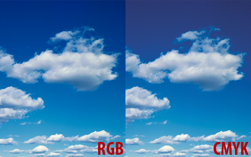
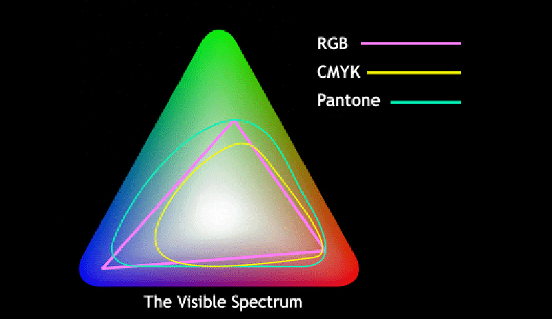
Different mediums require different Color Models. RGB is used for computer monitors, televisions, and other such digital screens. CMYK is used for print purposes. We can work to make RGB and CMYK colors identical, but it isn't always possible.

2. CMYK and RGB Uses
It's best to match color models with their preferred mediums. If you know that your project is meant for print, stick with CMYK. If you want your project for electronic purposes, go with RGB. If you're not sure, you can always request both and use them when you decide.
3. Screen Color is Simulated for Print
Since print color is different than screen color, we simulate the colors to make it look closer to the finished product. This way you'll have a better idea of your post-production results before you have to actually produce anything.
4. Every Monitor is Different
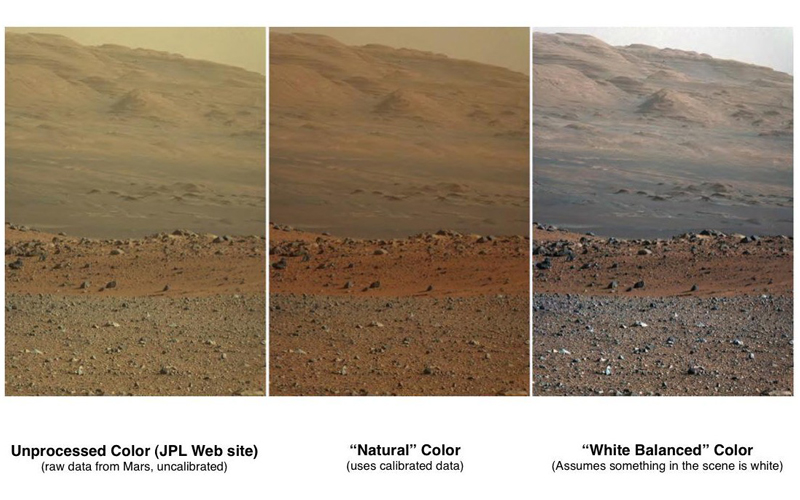
Not all monitors are created equal. Every monitor can show color differently than another due to the calibration or make and model. Make sure to consider your viewing conditions and request physical proofs to make true comparisons.

5. Light Affects Color
Monitors aren't the only things that can affect color. Different light sources can change the look of a proof and create confusion. Make sure to use the same light set up so that both parties are on the same page (and can see the same thing).
6. Lightening Images Can Change an Image's Colors
Lightening an image can be perfectly fine, but it can have some adverse affects to the colors. A lightened image will actually have new colors, which is a problem if you need a color match for products or other elements. Make sure to point out which colors need to stay the same if you need edits.
7. Pantone Colors
Pantone color swatch books can help you find an exact color and easily communicate what you want to your multimedia studio. This can help keep you, your photographers, and other parties all on the same page. Keep in mind that Pantone colors can be affected by the printing process, colorspace, and ink options.

8. Color Moods
Color is great for conveying a certain feel in an image. Be open about what mood or setting you want your image to project and we can play with the colors to achieve your look.
9. Color Perceptions
One color change can affect how another is perceived. Certain surrounding colors can make others seem lighter or darker than intended. Be open about how you perceive colors, because if your eyes are tricked, your potential audience may be fooled as well.

10. Know these Three Color Terms
Knowing the right language can help with communication. Here are three important color terms that will help you understand what a photographer or CGI artist is trying to explain:
- Hue - The identification of a color (red, green, etc.)
- Saturation - How intense a color is in an image
- Lightness - The brightness or darkness of an image
Talk Color with a Multimedia Studio
Are you in need of professional photography or CGI services for your business? Our team can help you bring your ideas to life and guide you through the process. Contact us today about your project.


