CATEGORY: FOOD

Case Study: Smith's Ice Cream
"We’ve always trusted the quality of work that TRG delivers on photography projects. We were looking for something unique with this packaging project to capture our vision for the brand position, which is ‘Tradition that you can taste.’ There are some packages that you’ll see where the food doesn’t feel very natural, where it seems forced, fake, or artificial. We didn’t want the SMITH's ice cream to be made from fondant or mashed potatoes or anything; we wanted the real ice cream. We wanted to capture it with that little bit of melt or drip to give it this appetite appeal and we knew that we could trust TRG to deliver on that."
Jeff Monter, Principal of Creative Services at Innis Maggiore Group, Inc

Digital Media Reel
Digital Media is quickly becoming some of our studio's favorite projects. Recently we created a super cool reel to showcase our recent Digital Media projects that we'd love for you to see.

5 Situations Where You Shouldn't Skimp on Retouching and Refinement
As a former retoucher I generally see the need for every single image to be retouched to some degree. There are so many subtle things that can be done to improve the attractiveness of an image that it just seems silly to me to not take advantage of it. However, if you were to pin me down and list the five projects that need to be retouched no matter what, I'd give you the following examples.

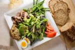
TRG Gets You More Food For the Same Price! [Case Study]
The Challenge:
Clients are always looking to improve their ROI, so TRG wanted to see if they could provide more imagery to clients by utilizing our time in a more efficient manner. The catch? We need to do this without increasing our costs, therefore keeping the cost to the client the same.

TRG Multimedia: Medical Mutual Ads for Cleveland Browns
Last fall TRG Reality teamed up with Wyse Advertising to create kiosk ads for Medical Mutual in Greater Cleveland. The ads featured the signature look of our favorite football team’s colors and helmet stripes.
